So called "new" interface completely unusable

How can I disable that "new" crap? It's a completely broken mess. I can't do anything. I tried every checkbox in the settings. Nothing works. Why isn't this a gadget that I can disable?
- It's slow as hell. My browser almost dies. Scrolling is a pain. There was no problem with the previous version. Why was it replaced?
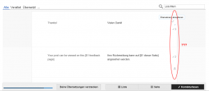
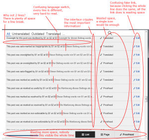
- It always does a search for "Liste filtern" (see screenshot 1). How to get rid of this? I never searched for this (bugzilla:47039).
- The design breaks on smaller screens (see screenshot 1) (bugzilla:46065).
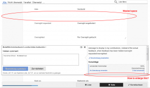
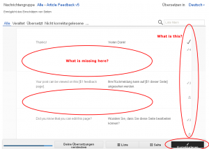
- Certain views are completely broken and not useable at all in Internet Explorer 9 (see screenshot 2).
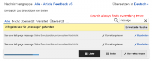
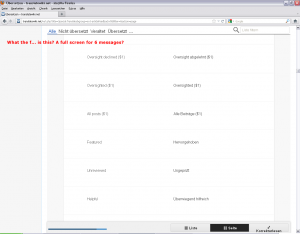
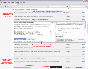
- How to open two translations the same time (see screenshot 3)? This was possible in the previous version. Now opening an other translation always closes the previous translation. Why? I want to work on multiple translations the same time. Why do you removed that feature? (not filed, but bugzilla:46955)
- How to enlarge the translation area so I can see everything like before (see screenshot 3)? I don't want to waste my time with scrolling in tiny little frames. Show everything like in the previous version.
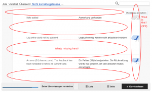
- At the same time there are huge white areas wasting lots of space (see screenshot 3). This doesn't make any sense. How to get rid of that?
Please disable that horrendous piece of code and give us the previous set of tools back. The previous version worked. There was no problem I was aware of. Make the new tool a opt-in gadget for some beta testers (it obviously is in an early beta stage). I don't have the time to be your beta tester. All I want to do is to fix a few bad translations. Give me a simple tool that works!
Thanks for your feedback we will take it to heart. We suggest you work with the new UI for a bit. We are confident you will get used to it and our research indicates that you will be much more productive when using it. Also, even though many still use it, Internet Explorer 9 is essentially an aged web browser. We highly recommend using one out of Chrome and Firefox.
Thanks for the nice answer. I was a bit upset. Sorry for that. In the meantime I found the &tux=0 hack in the other thread.
Your suggestion to "work with the new UI for a bit" is nice but does not help. Even if I want I can't. It does not work. It's slow, cluttered and confusing. There are many features missing or hidden. I don't believe I can be more productive with a tool that has less features and hides major parts of what I need behind tiny little scrollbar iframes.
I'm not a regular Internet Explorer user. I'm an Opera user. But the browser is not my point. I don't have a problem if you consider certain browsers outdated. But you need to provide an easy to use fallback for these users. The old tool still works. There is no need to force all users to use the new tool. Especially if it does not work with the browser of the user. It's stupid to kick the users of such browsers in the face without an easy to use fallback. Make the tool an opt-in gadget for now. Fix the bugs. Make it a default gadget later.
Both tools do exactly the same but currently the old tool is way faster, a lot simpler, less cluttered and therefor much easier to use. You still have a long way to go to make this a good replacement.
We have tested a bit (*blush* we really hadn't tested on Internet Explorer and users hadn't reported issues before the launch, even though we invited time and again to use the new features and report them).
Here's a little overview:
High priority open:
- https://bugzilla.wikimedia.org/47039 - [TUX] [IE9] Placeholder is used as instant filter. Amir is working on this
- https://bugzilla.wikimedia.org/47019 - [TUX] [IE10] Editor severely broken - https://gerrit.wikimedia.org/r/#/c/58287/ doesn't fix all. Warnings about unsaved content still exist.
Other open:
- https://bugzilla.wikimedia.org/47041 - [TUX] "Advanced search" does not fit button on 1024px wide screen
- https://bugzilla.wikimedia.org/47038 - [TUX] [IE10] X in filter field is duplicated when text is entered
- https://bugzilla.wikimedia.org/47044 - [TUX] Translation of "V Proofread" does not fit button on 1024px wide screen if it's only a few characters wider
Closed:
- https://bugzilla.wikimedia.org/47036 - [TUX] [IE9] JavaScript error for anonymous user
- https://bugzilla.wikimedia.org/47034 - [TUX] Cannot filter list
- https://bugzilla.wikimedia.org/47032 - [TUX] [IE9] "Loading messages..." does not complete
- https://bugzilla.wikimedia.org/47033 - [TUX] [IE9] Results keep on being reloaded and added to the list
We made good progress. At some point, we just have to launch software, otherwise it will be a promise forever. The old editor actually isn't great. It is really bad. You just got used to something bad, and now we are hurting you in two ways: By forcing to change away from the bad tool you worked with to a tool that works a lot better, but that has bugs. Because of that you get annoyed. Sorry for that.
Please keep on reporting bugs. if possible, in our bug tracker and with enough detail for it to be actionable. See above for examples of bug report that I mostly personally made, that are very actionable for developers.
I said that before: I'm not your beta tester. It's not my job to report bugs. There is a single major bug that can be summarized as "the new interface is a pain".
This is not just me. Multiple users in the German Wikipedia said exactly the same. Also multiple users here in the discussion threads say the same.
Listen to the users. Please. I'm begging you.
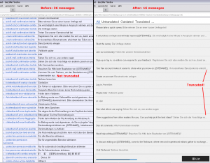
All we want to do is to provide a few better translations for the MediaWiki and various extensions. We want to do something productive. We were able to do this with the previous editor. There was nothing wrong. No bug we were aware of. We were able to click "edit", to edit a translation and to save it. We were able to edit many translations very fast because loading the tool was very fast, scrolling was fast and there was a lot of information on a single screen (approx. 36 lines on one screen, see the screenshots). And we were able to edit multiple items the same time.
Not a single of these use cases is possible with the so called "new interface". It loads very slow. Scrolling is slow as hell. Even on very fast computers (this is a 2.5 GHz quad core, 4 GB). It forces us to scroll a lot. We need to scroll at least two times more, sometimes six times more (only 16 lines on a screen, sometimes only 6, see the screenshots). The same time important informations are hidden in tiny little scroll windows. All this does is wasting our time. We can't edit multiple translations any more. The design is broken. Buttons do nothing. And everything is so insanely slow. It's not fun to use the interface because of this. It's frustrating. It's a pain.
You are not only wasting your time, you are wasting the time of your users.
Turn that broken stuff off and let us continue to do the work we want to do here in the Translatewiki. This work is not "help the WMF to fix major bugs in an interface nobody ever wanted". This work is translation.
Thank you for listening.
3 is already filed; 2 should be if it isn't (with steps to reproduce); 1, 4, 7 are – I suspect – just due to the fact that the new interface doesn't support old computers and small screens; 5, 6 are rather basic needs for experienced translators but apparently most translators don't need them.
Now that I think of it, there's a bug in Vector that reminds me of 2: does the placeholder keyword in the normal Vector search bar work for you? It should stay on the background and disappear as soon as you type something else.

"steps to reproduce". There are no steps. Call a random translation page like this: [1]. Done. You will see the result in the screenshot.
"the new interface doesn't support old computers and small screens". This is a 1680x1050 screen and a 2.5 GHz quad-core. The only thing is that I did my test with Internet Explorer 9 (on purpose) and I shrinked the browser window (on purpose). Internet Explorer 9 is not old in any way. Such a simple tool (all it does is editing single lines of text) must work in a 2 years old browser under all circumstances.
"does the placeholder keyword in the normal Vector search bar work for you?" Sure it does. I would have filled a bug report years ago. "It should stay on the background and disappear as soon as you type something else." The text in the filter input does the same. It goes away when I focus the field. That's not the problem. The problem is that the default text is used to filter the list right from the start. Every time.
"apparently most translators don't need them." Your opinion. I use then. For what reason are useful tools removed? Why is it forbidden to open two translations the same time? What's the reason for this? It worked in the old interface. It still works. What was wrong with this degree of freedom?
I tested the interface with some other browsers (Opera 12, Firefox 9). It's the same mess everywhere. It wastes huge amounts of space for absolutely no reason. Like it is made for a 2560x1440 pixel screen (and only for such big screens). The whole proofread page looks like it's complete broken. Non-responsive interface elements cluttered everywhere and so much space wasted that only 3 (three!) messages fit on one screen. It's impossible to do anything useful with this. I don't see anything because everything I saw before is now outside of the screen. It's like I look at the page through a tiny little hole.
There is something called a "page" view. It wastes so much space that only 6 (six!) messages fit on a screen. The "list" view shows 16 messages. The old interface showed 36 messages in comparison. More than twice the count! And they were not truncated like they are in the new interface!
I really try to understand and to give it a chance. Really. But I can't. It does not make any sense. What is better in the new interface? I don't find a single bit that is better. Just confusion, broken stuff and insane amounts of completely useless white pixels.
Please define the minimum requirements to use the new editor, and add to the documentation for translators, if not already done.
I also need and make use of the feature requested as 5 above a lot and all the time. I can and do of course use multiple browser windows which isn't always comfortable but workable. The new translation interface limits the number of useable browser windows even on modern computers, making them too slow to work with and finally killing at least Mozilla after a while of work and window switching.
Also I "don't want to waste my time with scrolling in tiny little frames." While the new interface put another hell of a lot of unneeded partly duplicate drivel around the translation work fileds, I criticise also the last editing screen being too full and far too unflexible to the make the needed adjustments. Now it is worse yet another time. As a rule of thumb: When you introduce a new subfield somewhere, make it both detacheable and completely resizeable in all directions even if not detached, and provide for a way to keep such user-made settings forever (plus a "restore factory default" for those who messed it up)
It's a common and almost ubiquitous mistake not to limit the hight of sidebars and navigational colums in websites. Mediawiki (with most of its skins) has it, too. It apears even more stupid, and is driving me mad, as it's most easily avoided with somewhat better CSS. You can avoid it providing a local CSS if your browser supports it.