So called "new" interface completely unusable


"apparently most translators don't need them." Your opinion. I use then. For what reason are useful tools removed? Why is it forbidden to open two translations the same time? What's the reason for this? It worked in the old interface. It still works. What was wrong with this degree of freedom?
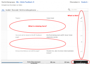
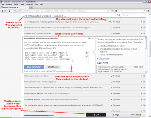
I tested the interface with some other browsers (Opera 12, Firefox 9). It's the same mess everywhere. It wastes huge amounts of space for absolutely no reason. Like it is made for a 2560x1440 pixel screen (and only for such big screens). The whole proofread page looks like it's complete broken. Non-responsive interface elements cluttered everywhere and so much space wasted that only 3 (three!) messages fit on one screen. It's impossible to do anything useful with this. I don't see anything because everything I saw before is now outside of the screen. It's like I look at the page through a tiny little hole.
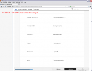
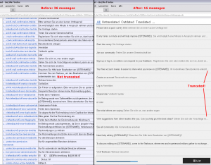
There is something called a "page" view. It wastes so much space that only 6 (six!) messages fit on a screen. The "list" view shows 16 messages. The old interface showed 36 messages in comparison. More than twice the count! And they were not truncated like they are in the new interface!
I really try to understand and to give it a chance. Really. But I can't. It does not make any sense. What is better in the new interface? I don't find a single bit that is better. Just confusion, broken stuff and insane amounts of completely useless white pixels.