So called "new" interface completely unusable


I said that before: I'm not your beta tester. It's not my job to report bugs. There is a single major bug that can be summarized as "the new interface is a pain".
This is not just me. Multiple users in the German Wikipedia said exactly the same. Also multiple users here in the discussion threads say the same.
Listen to the users. Please. I'm begging you.
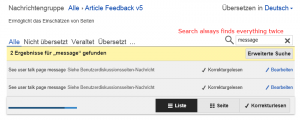
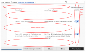
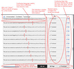
All we want to do is to provide a few better translations for the MediaWiki and various extensions. We want to do something productive. We were able to do this with the previous editor. There was nothing wrong. No bug we were aware of. We were able to click "edit", to edit a translation and to save it. We were able to edit many translations very fast because loading the tool was very fast, scrolling was fast and there was a lot of information on a single screen (approx. 36 lines on one screen, see the screenshots). And we were able to edit multiple items the same time.
Not a single of these use cases is possible with the so called "new interface". It loads very slow. Scrolling is slow as hell. Even on very fast computers (this is a 2.5 GHz quad core, 4 GB). It forces us to scroll a lot. We need to scroll at least two times more, sometimes six times more (only 16 lines on a screen, sometimes only 6, see the screenshots). The same time important informations are hidden in tiny little scroll windows. All this does is wasting our time. We can't edit multiple translations any more. The design is broken. Buttons do nothing. And everything is so insanely slow. It's not fun to use the interface because of this. It's frustrating. It's a pain.
You are not only wasting your time, you are wasting the time of your users.
Turn that broken stuff off and let us continue to do the work we want to do here in the Translatewiki. This work is not "help the WMF to fix major bugs in an interface nobody ever wanted". This work is translation.
Thank you for listening.