Talk:Main Page
| Please discuss here only things about the Main Page. General discussion should go to Support. |
Archive (till August 2009).
- [View source↑]
- [History↑]
Contents
Hi.
When I load Main Page, my browser's pretty green lock icon turns yellow due to this:
The page at https://translatewiki.net/wiki/Main_Page displayed insecure content from http://upload.wikimedia.org/wikipedia/commons/0/0a/VicunaUploader_logo.png.
I'm not sure why this is.
Hi.
When I load Main Page, I get a console warning that a file is missing.
From <https://translatewiki.net/w/load.php?debug=false&lang=en&modules=site&only=styles&skin=vector&*>, I can see the following code:
background-image:url('//translatewiki.net/static/btn2.png');
However <https://translatewiki.net/static/btn2.png> does not exist.
Hi all, I am translating Blockly apps to Greek. I have noticed that the JSON files generated have each message's characters encoded as escape sequences representing the UTF-8 encoding of the character. In Greek, for example, 'Κίνα' (China) is shown as "\u039a\u03af\u03bd\u03b1" etc. The same happens on most of the non-ASCII languages (Russian, Chinese etc). I think one (of many) good reason for having data in json files is that json can be easily read by humans. Can you do something about it?
Best regards, -- Alexandros Zountas
Main Page does not take the maded translations, can be because of protection? As this correct?
After writing the page all translations are shown, but only preamble "Translatewiki.net is a localisation platform for translation communities, language communities, and free and open source projects." is not changed. As its change?
That's weird, indeed. I've tried purging the page, but that didn't help. Maybe Niklas knows...
https://translatewiki.net/w/i.php?title=Main_Page&uselang=uz
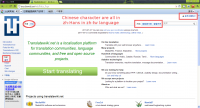
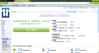
No matter which browser I use, for example, Firefox, Chrome and Opera, Main page of translate.wiki shows zh-hans translations and English strings. Acctually, zh-tw language users should use zh-hant translations instead of zh-hans.

I use Chrome for this screenshot.
For example, I have checked about:config values in Firefox, "general.user.agent" is "zh-TW" and "intl.accept_languages" are "zh-tw, en-us, en". So it does not make sense to use zh-hans, there must be something wrong behind this problem.
After I logged in Translate.net, those strings showed the right translations. However, we should not ask everyone who use zh-TW language to register and log in to have the right translations showed.

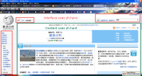
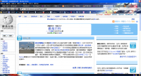
The problem seems to extend to Wikipedia.


Can any technical guy help zh-TW language users to solve this problem? Please help.
Nice find. We rarely use translatewiki.net while not logged in and this issue (incorrect accept language mapping) deserves a solution.
I would like this problem be fixed as soon as possible to help my language.
Do anyone know that who I should contact for this issue? Please help us to convey this issue to developers if you can. Thanks in advance.
I'm still traveling this week, so I don't have time to look at it.
Looks like this behavior has been there for many many years. The message loading sequence doesn't check for fallback translations in mediawiki namespace.
Can/should be fixed? (think so...)
It's possible and even reasonable. However we should be prepared expect ugly issues on WMF projects that might rely on the current behavior a tad too much.
It seems that comments by anonymous users are disallowed. That's fair enough, but it would be good to give some warning message; instead, it just keeps asking math questions...
This a bug in Liquid Threads extension. Anonymous can edit but not create pages.
The links to statistics on the current main page are all to statistics for MediaWiki and its extensions, I think. So is it your idea that all these links are moved to the MediaWiki project page? That would be good I think.
We already have a Translating:Statistics page but at present this page holds statistics for MediaWiki only. Is it possible to have this page show links to statistics for any and all projects? Could you include a section at the top of the page of statistics for translatewiki.net as a whole? This would include links to each of the statistics special pages, and a short description of each page. Then statistics for MediaWiki would have their own section, and any other project which might have translation statistics would have their own section on the page.
Perhaps the very first link on the Translating:statistics page could be to the 'language statistics' special page, as this is also a very useful translation tool, as well as providing statistics. In addition, is it possible to have a link to the 'language statistics' special page on the sidebar? If so, is that an efficient use of computer resources?
Then on the main page, if you want it as uncluttered as possible, you could just have a link to the Translating:Statistics page. Or if the main page gets too cluttered, you could just do with a link to Translating:Statistics from the Project:About page. Or it might be an idea to whet the appetite of potential translators with something like: "Want to see what messages are waiting to be translated into your language? Find the language code for your language and then browse a list of message groups to be translated for your language." Come to think of it, is it possible and efficient to include a link to the 'Maintained languages' special page on the 'LanguageStats' special page, for the benefit of visitors who don't know the language code of a particular language they are interested in? Or a message saying "Click on 'Maintained languages' in the sidebar to see a list of languages and their codes."
I would also be tempted to put a link on the main page to the Translating:Group_statistics page, for the benefit of visitors in general and potential new projects in particular. But the group statistics cover MediaWiki only at present, so that's not such a good idea. Is it possible to produce a group statistics page which covers all the projects, not just MediaWiki?
See sitenotice for a redesign of the main page. We should't discuss the current main page. The links to the statistics for individual projects should be on the project pages, and there are some sections that could use a link to Special:LanguageStats, Web_interface specifically.
All the above suggestions are supposed to be to do with the development of the new main page; sorry that that wasn't written clearly. I was only referring to the old page to consider the impact of losing the information that is currently on the old main page. I like the layout of the new main page, by the way, but won't have time to write more until the weekend, perhaps.
Any idea why I suddenly dont get the popup-box for translations. Suddenly it opens the translation on the entire page?
- Update Template:Projects
- Make a page in the MediaWiki namespace with the key of the message. For the key "twn-project-eol" you create [[MediaWiki:twn-project-eol]]. The key has to be completely in lower case .. ie not EOL but eol
- add the key to [[MediaWiki:Twn-mainpage]].
- wait for someone to update the wiki; this will include the message in the message group. When someone runs "createMessageIndex.php" it has the same effect as updating the wiki.
It hink it woould be a good idea to add the language that the page is viewed in to the section on the main page where it says:
  Hundreds of languages
        Communities for Arabic, Catalan, Russian, Tamil...
In that way when new people find the site they would know that there languages also is supported be translatewiki.org. What do you think about that idea?
What if it isn't? Besides most browsers are configured to show up in English.
I just think that from my perspective it would be nice if Danish were on the list, and so for people that speak other languages. And the thing about browser: Every computer and every browser I opened translatewiki.org with in Denmark showed Danish by default.
Nothing should prevent you from replacing some language with Danish in that list.
Hi, I just want to say that I really like the new main page. It is really tidy now and does not scare off potential translators. One little suggestion: Perhaps it is possible to condense the part above the project list to reduce the space needed there (margin-top and margin-bottom). Right now, you are using a lot of blanc space which increases the hight of the page. To my personal experience it is always better to reduce scrolling. Cheers --kgh 08:34, 6 July 2010 (UTC)
Thanks for a kudos. It cost many sof us a lot of sweat :)
I have removed the whitespace I could find, and that didn't appear to reduce whitespace between the top and bottom halves. Would appreciate help. Please create a concept for an update, making a copy of the main page in Main Page/draft and make the updates there. Please let us know when done so we can assess the result.
I looked at the browser preview of the new main page. Between the text
Translatewiki.net is a localisation platform for translation communities, language communities, and free and open source projects.
and the button
Start Translating
is shown a <p> tag containing a <br /> tag only: <p><br /></p>. The same is between the text of
Assistive technologies
and
We are looking for help.
The <p> tag inserts a new line before and after text and <br /> additionally a line break.
I expect that the language selector is going to be added back to the new main page. Is it best to place it somewhere with no comment or is it best to add a sentence above it, something like "Change site language here".
The translatewiki.net main page slogan now has '..free and open source projects' in it. Wikireader is not free in the sense that it costs nothing - you pay $99 for the gadget. So is the 'free' here potentially misleading?
You'll have to judge this one on its merits: instead of "Projects using translatewiki.net" I'd say "Projects already using translatewiki.net".
Yeah, it was originally "Our projects", but that wasn't really correct either.
Comparing the existing main page with the draft of the new one, I see we have got rid of the 2-paragraph introduction which includes the sentence about translatewiki.net not being part of MediaWiki or any other project. I think that this is quite important to understand and I’m not sure how many visitors would easily find their way to the About page by using the link at the bottom of the main page. It might be best to add a special link to the About page in a new section, after the section ‘We accept new projects’. Proposed text of new section:
About us
We are not part of MediaWiki or any other project… Learn more
I have also suggested some additions to the About page – see its talk page.
Can it be said with other words? The thing to understand here is that we have many projects and that we are independent and not that we have nothing to do with our projects and hate them (which is of course not true).
Hmm. How about 'We are an independent project, localising open source projects at their request...learn more'.
Or if you think that, since this information is in the first two paragraphs of 'About', we don't need it on the main page itself, then we could just go for something like 'Want to know who we are? Click here.'
In my opinion the current main page doesn't serve us well. Some things that I would like to see in the new version:
- Big link to Special:FirstSteps
- More prominent display of our projects
- Refined target of this wiki
- Some latest news. Maybe from twitter?
- Some other highlights of this wiki, what?
Any other opinions?
Something to ponder:
- Who are the target audience of the front page?
- I think that those are new translators and people who want to know what translatewiki.net is about
Also, how about a video recording which shows how to translate and tells little about the process overall?
I made a draft at Main Page/draft. Please feel free to comment.
Notes: at least the Get started should/will be replaced with nicer button. The links the main page refers to should be written, of course.
One problem in the current draft: It is not obvious what Get started refers to. Must mention that it is about becoming a translators or something.
I really like the draft, except for the upper left part (the one in green text). It just seems a bit too "shouty" if you know what I mean... Maybe try to tone it down i little bit.
Otherwise, the big footer with the icons is really nice, and i also really like the upper right part.
The shouty part will stay. This is one of the best aspects of the new main page proposal. Elements that call to action are a must if that is what you want (effective buttons 101).
When viewed through IE8 a green button looks strange - see screenshot http://s001.radikal.ru/i196/1004/ae/e7eee96ac457.jpg And I do not fully understand where to migrate the current multilanguage MainPage content?
You appear to be watching it in Monobook skin. That's not our default skin; in Modern - as well as in Vector - it looks just fine. I've tried to reproduce this with Monobook in both IE8 and Firefox 3.6, but neither browser shows the dents that are visible on the screenshot...
The multilanguage main page that we currently have will be obsolete and require retranslation for the new main page. The multi language component has not been implemented yet, but will be as soon as or before it goes live.
The new main page draft looks really good. I have a suggestion:
If the language of the user (that is, logged-in users) is known, show the following details for each project: (1) the % completion (2) the number (or %) of messages to be translated/defuzzied (if any) with a link directly leading to the translate page.
For the moment that's too expensive in CPU processing. We need to concentrate on the message first, and whenever we have CPU and disk IO in abundance, we can think of making that type of statistics available. As we are assuming that translators do not have the main page as entry point, we mainly focus the main page contents to those yet unknown with translatewiki.
P.s. feel free to make textual changes, and well ones will stay in as long as they are concise and on topic :)
This new design definitely looks hot. I must honestly admit that it took me some time to figure out how exactly to translate here, an issue that this design might solve.
I like new design, except that hovering effect over "start translating". IMHO setting it to default Red will be great
I prefer the green color on the button, it's more inviting. I find red more of a warning-color. Sort of like pushing a button you might regret pushing... If it has to change color, then maybe to a darker shade of green?
I suggested red as more catchy ;). Yes, but it has a warning tone. Anyway I think that big colour change on mouse over is not eye friendly. A simple glow effect can do better.
Let's not argue over the colour of the bikeshed. We're still looking for someone who would be able to create two short videos (max. 90 seconds). The first showing how to (a) register an account, (b) set language in preferences, (c) create a basic user page, (d) request permissions, (e) confirm e-mail address. The second would deal with with the initial steps in the translation process. (a) click "Translation tool" in the menu (b) pick a group to work on, (c) selecting a message to translate (d) saving/go to next navigation (e) use of translation hints (all options: Translation Memory, Google Translate and Apertium). If you have the tools to create any or all of these videos, we would highly appreciate your skills.
Is it worth adding a link to the guidance on starting a new language project on the main page, in the section on "Hundreds of languages"? Something like - If your language isn't listed in the language box above [or below, etc], find out how to start a project for your language at Translating:Process#New_language. I will make some suggestions on improvements to that guidance when I have the time.